“What we’ve got here is failure to communicate” — this dialogue from Cool Hand Luke was listed at number 11 in the 100 years … 100 movie quotes list. This dialogue is often so relatable to a day in the life of a data visualization expert. Data visualization is all about communication. And an unsuccessful data visualization almost always leads to communication failure.
We started our data visualization blog series by sharing our experiences about various real-world problems. In this blog, we discuss the challenges in data visualization. So, let’s start by talking about communication failure!
To begin with, let’s refer to an example of presenting climate change report.
- Figure 1(a) shows a plain text representation of the insights related to the climate change. This representation is difficult to consume. Let’s try to do better than this.
- Figure 1(b) attempts to present this data in a tabular format. It has all the content however, it does not provide any assistance to derive interpretations. The communication still fails.
- Figure 1(c) takes a step ahead and uses a multi-coloured column chart to present this data, and — voila! it gets so much to derive inferences. Here are some of the inferences that become easy to derive.
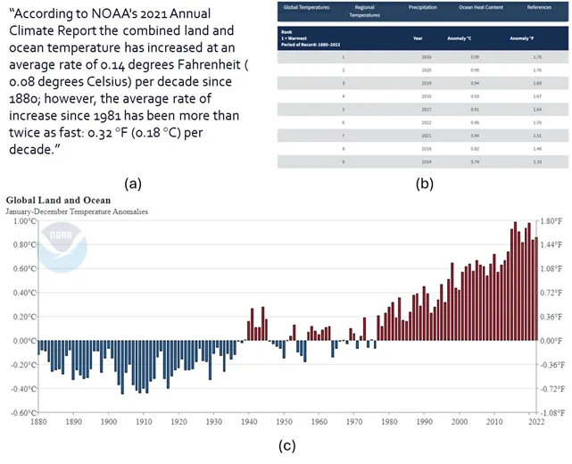
This example establishes the power of data visualization. By bringing data to life using insightful plots and charts, data visualization is vital in decision-making processes. Whether it’s the data analysts breaking down their findings to non-technical stakeholders or it’s the data scientists performing A/B tests for marketing purposes, or it’s the machine learning engineers explaining potential bias in complex large language models such as ChatGPT, data visualization is the key to moving from data insights to decision-making.
However, data visualization, if not done right, can easily fail. Many detailed data representations end up in the drawer because they failed to captivate the audience. In this blog, we will explore some of these challenges, understand how and why they manifest, and some real-world tricks to address them.
Data Quality Challenges
Data quality issues can affect the credibility and validity of the visualization and consequently lose the trust and confidence of the audience. Many times, lack of due care in data quality leads to ineffective visualization or, worse, incorrect interpretations.
Visual cues of missing data: Data is considered complete when all the data required for particular use case is present and available to be used. Incomplete data can easily lead to incorrect conclusions. Figure 2 demonstrates this with an example. Figure 2(a) shows a column chart with a metric value over the years. However, a closer look will show that the chart is missing data for many years between 2011 and 2019. Rendering this chart in this fashion hides this fact and thus misleads the user. Visualization should handle missing data with appropriate visual cues to make missing data explicit to the user as shown in Figure 2(b).

Data Selection Challenges
Data selection presents another common challenge in data visualization. It involves deciding what data to include or exclude, what level of detail or aggregation to use, what variables or dimensions to focus on, and what comparisons or relationships to highlight. It also requires a balance between showing enough data to provide evidence and insight, and avoiding too much data that can overwhelm or confuse the audience.
Interactive selections: Figure 4 presents a line-chart that is rendering too much data. Figure 4(a) renders a 10-line chart making it very difficult to interpret. Right use of colours and interactive visualization often comes as handy tools to deal with rendering large data. Figure 4(b) presents a concept of allowing to select/deselect the line charts making it easy for the viewer to interpret data.

Interactive drilldowns: Let’s look at another example wherein too much data leads to poor understanding and inaccurate conclusions. Figure 5 shows an example of Major league soccer salaries for the month of May 2013. Figure 5(a) shows the salary of each player of each team. Each tile is color-coded by player position and the size of each title represents the salary of the player. As we can see, this representation inundates the user with too much information to consume.
Often, an effective solution to present large data is through interactions visualization to represent aggregated data and then enable systematic drill down to more details. Figure 5(b) simplifies the chart by reducing the content. Instead of rendering the salary of each individual player, it groups the salaries based on the player positions such as forward, defender, midfielder, and goalkeeper. Clicking on each element can then further drilldown into the player-level details of that team.
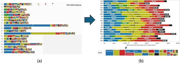
Figure 6 presents one more example of managing large scale visualization using a systematic drill-down. Batch processes usually consist of a large complex flow of batch jobs. These jobs are interconnected via complex precedence relationships. Rendering this entire process in one single view gets visually overwhelming as shown in Figure 6(a). Instead, Figure 6(b) renders a drill-down view. It first highlights the health of business processes, the ones that need attention, and only deep-dives into the jobs of one specific process. This simplifies the overall visualization experience and significantly improves the usability of the data-driven insights.

Data Representation Challenges
Another fundamental challenge circles around data representation. If the data is of the right quality and has just the right level of detail, selecting the right visual metaphor plays a huge role in conveying the right message from the data. Data representation involves selecting the appropriate type, format, and style of data visualization, such as charts, graphs, maps, tables, icons, or images. It also involves applying the principles and best practices of data visualization design, such as colour, shape, size, layout, alignment, scale, contrast, and hierarchy.
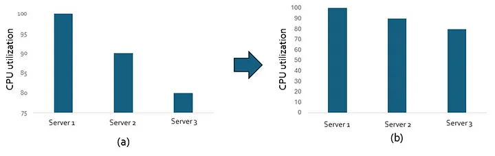
Avoid misleading data representations: Figure 7(a) shows the average CPU utilization of 3 servers. A closer look reveals that the y-axis starts from 75 instead of 0, which leads to incorrect interpretation that the 3 servers observe very different average CPU utilization. Figure 7(b) renders the y-axis from 0 to 100 and presents the true interpretation that the 3 servers have comparable values of average CPU utilization.
Ensemble approach to selecting chart types: Selecting the right chart type makes a huge difference in the interpretability of data visualization. However, often for a given visualization, one single chart type is not enough. Such situations need an ensemble approach to select different chart type based on the volume or variety of the data. Similar ensemble approaches are now getting adopted in algorithms and databases.
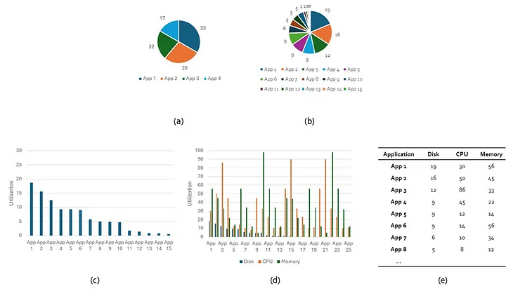
Consider the problem of rendering the disk space used by applications.
- Figure 8(a) shows the disk space used by 4 servers using a pie chart. A pie chart is a perfectly good metaphor when the categories are few.
- However, the same pie chart becomes practically unreadable in Figure 8(b) when the number of categories increase to 15. In such cases, a column chart presents a better representation as shown in Figure 8(c).
- However, the column chart becomes difficult to read when there are too many metrics to render for each application. Consider Figure 8(d) which shows disk space used, reads, and writes for each application.
- Sometimes an interactive visual with tables that allow you to sort, filter, and search from the available data is the easiest and most useful medium of visualization as shown in Figure 8(e).
This ensemble approach to visualize data has been an effective solution in many scenarios. Figure 9 presents one more such example. One of the most challenging visualizations is to render inventory and how it is organized hierarchically into various categories. Some common scenarios include visualization of the inventory of a retail store, or the various software or hardware elements of an enterprise IT estate. Different challenges are presented in this visualization such as too many items, too many categories, an item being part of more than one category, and a deep hierarchy of categories and subcategories. Naturally, a single visualization metaphor is not enough to render such complex data and an ensemble approach offers an effective solution. Thankfully, various suite of tools are available to render inventory data in different forms and different chart suits different needs.
- A treemap view displays hierarchy using nested rectangles. Figure 9(a) shows an example wherein the treemap has been used to render car sales of different brands. This view is usually effective when the category hierarchy is not too deep.
- A circle-packed view displays hierarchy in the form of nested circles. Here sublevels are displayed as smaller circles inside larger circles. Figure 9(b) shows an example of circle-packed chart to render fruits and vegetables grouped under various categories and sub-categories. This view enables rendering of a deeper hierarchy than the rectangular tree-map view, but it still cannot scale to very deep category hierarchy.
- Dendrogram view represents hierarchy in the form of a tree view. This view is ideal to render deeper-complex relationships. Figure 9(c) shows an example of how a dendrogram view is used to render the hierarchy of continents, countries, and cities.

Similarly, there are many more charts available to render hierarchical data, but no single chart suffices all rendering needs. Hence, ensemble approach presents a practical alternative. Assess the depth and breadth of the hierarchy and select the right chart to best meet the data needs.
Conclusion
Data visualization plays a pivotal role in making data analytics explainable and accessible. However, data visualization presents some unique on-ground challenges which often leads to communication failure. In this blog, we discussed some of these challenges and presented some real-world tricks to address them.
We will continue our journey of exploring the unchartered waters in this space of data visualization in the upcoming blogs. Stay tuned!