In today’s digital age, data isn’t just numbers and figures confined to spreadsheets; it’s a vast landscape of information waiting to be unveiled. Data visualization serves as the gateway to unlock this treasure trove, transforming intricate datasets into captivating visuals that convey stories, trends, and insights. From colorful infographics to interactive dashboards, data visualization has become a powerful tool in deciphering complex information.
In this blog, we discuss how artistry and scientific principles work together to shape effective data visualizations. Designers carefully select colors, shapes, and visual elements to evoke emotions and convey information intuitively. Consider the stunning visualizations by Information is Beautiful, which merge aesthetic elegance with data-driven storytelling, turning raw information into captivating works of art.
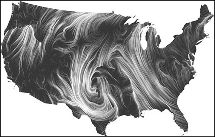
At the core of effective data visualization lies scientific rigor. It’s not merely about making data pretty. It involves cognitive psychology, and principles of human-computer interaction to ensure accuracy, clarity, and meaningful representation. An interesting work in this space is by data visualization researchers Fernanda Viégas and Martin Wattenberg, who explore the intersection of art, science, and technology in their work. They focus on creating interactive and engaging visualizations that invite exploration and discovery. A cool example of their work is the project “Wind Map,” which visualizes wind patterns across the United States in real-time, using animated lines and colors to depict wind speed and direction. The mesmerizing visualization captivates viewers while providing valuable insights into weather patterns.
From the way our brains process information to the emotional impact of color choices, let’s delve into this science that shapes how we perceive and understand data.
Visual Perception
Researchers have studied how humans perceive and draw inferences from visual design. A very prominent work in this space is Gestalt principles. Gestalt principles are developed on the philosophy of holism — that is — whole is greater than the sum of parts. These principles help designers organize and structure data visualizations in a way that facilitates understanding and enhances the overall user experience. Below, we present a few examples of Gestalt principles.
Proximity: The nearer the objects to each other, the more we logically think that these objects belong to the same group. The following example explains this law using a basic bar chart. Because of the proximity of the bars, we associate the two bars as a group. In addition to that, the proximity of these bars with the labels creates a logical grouping.
Similarity: When elements share superficial characteristics such as color, shape, size, etc. we tend to perceive them as related or part of the same group. Consider the following multi-level pie chart of browser market share. Notice how the multi-level pie chart uses color to group related entities and differentiate them from other groupings.

Closure: Humans prefer complete shapes. Consequently, when presented with incomplete visual information, our brains tend to fill in the missing gaps to perceive complete shapes or patterns. The following figure represents a change in population over the years. The chart has the data missing for the year 1970. However, when we look at this chart, our minds automatically imagine a line connecting the 2 broken lines.

Continuity: The law states that our eyes instinctively group things aligned with each other. The human eye follows lines, curves, or a sequence of shapes to create pathways. Consider the following example of the bar chart, our eyes follow a continuous path; it makes the whole chart more readable because of the continuous downward direction. If you look closely, we have not used the X-Axis line in this chart. But we see these bars as sharing a common baseline due to the law of continuity.

Cognitive Processing
Data visualization can be most effective by understanding the cognitive processing that is involved when humans interact with the data. Three cognitive processes come to play when humans consume data visuals — perception, memory, and attention.
- Perception: This is the first step in cognitive processing and refers to how we interpret visual information. Context setting plays a big role in how humans perceive data visuals.
- Memory: This refers to how we store and retrieve information present in the data visuals. Memory can be short-term or long-term and helps us interpret the data visuals based on the existing knowledge.
- Attention: This refers to how we focus or prioritize on a subset of information in the overall data story.
Setting up a context and a narrative plays a key role in making the best use of these cognitive processes in data visualization.
- Context refers to the background information about the data that helps establish a frame of reference to understand the data. Context is built by identifying who the story is for and what we want them to do with the story.
- Narrative, on the other hand, refers to the story that is developed with the data visuals. It helps to create a coherent message from the data visuals.
Let’s take an example of a bar chart that shows data for monthly revenue of a company from different product category.
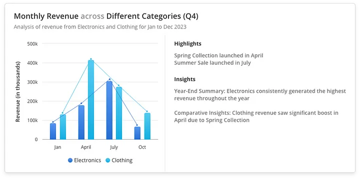
Now let’s view this chart from Context and Narrative perspective.
Context
- Who: The audience is clearly identified as the product management and sales team.
- What: The graph shows monthly revenue by category.
- Why: The purpose is to help the teams understand the performance of both the product categories, identify trends, and make informed decisions about inventory and marketing strategies.
By providing this context, the graph sets a clear frame of reference for the audience, ensuring they understand the relevance and background of the data.
Narrative
- Introduction: The graph begins with a broad overview, showing total revenue for each month across both the categories.
- Middle: Detailed monthly revenue is highlighted, with specific annotations explaining spikes and dips in revenue. For instance, the Spring Collection Launch in April and the Summer Sale in July are directly linked to changes in revenue figures.
- Conclusion: Key insights and recommendations are provided, summarizing the performance, and suggesting actionable next steps, such as focusing more on marketing efforts during the holiday season to boost revenue.
This narrative guides the viewer through the data, making it easier to follow the story, understand the key points, and take appropriate action based on the insights provided.
Color Theory
Color is a highly subjective aspect. Different color schemes work for different users. However, researchers and practitioners have spent significant efforts to develop an evidence-based science of color theory. Color theory plays a crucial role in guiding the strategic use of color in data visualization, ensuring that visual representations effectively convey insights and patterns to viewers.
Once you have decided the attributes that you want to depict using colors, then a very important aspect is to select the type of color scale that you need for your data. Data usually belongs to 3 types of scales and each scale demands a different set of hues in the color palette:
Sequential Color Scales are used for data that progresses from low to high. These scales are ideal for representing ordered data, where the progression of values matters. Typically, sequential scales use a single hue that varies in intensity or lightness. For example, a calendar heatmap where we can show average temperatures over the country across the month where lighter color represents cooler temperature and darker color indicate warmer temperature.

Divergent Color Scales are used for data that has a meaningful midpoint or critical value, such as zero, around which the data diverges. These scales are useful for showing how data deviates from a central point. It typically uses two contrasting hues that diverge from a neutral midpoint color. For example, in the following graph we show profit and loss with the help of divergent scales that show red for losses, blue for breaking even and green for profits.

Qualitative Color Scales are used for categorical data where there is no inherent order. The colors in this scheme should be distinct and easily distinguishable from one another. There is no progression in lightness or intensity, as each category is equally important. For example, the following geo-map uses qualitative scale to represent different countries with different colors.

It is often a good idea to opt for an obvious set of colors that a user can understand without a legend. For example: Red and Green for unhealthy and healthy areas, or Red and Blue for hot and cold areas are some universally understood color maps.
Cognitive Load and Information Overload
Our brains have limits on how much information we can process at a time. It can easily get overwhelmed when presented with large and complex information. This often results in less comprehension and even less retention. Consequently, cognitive load is a critical consideration in data visualization. Cognitive psychology insights offer valuable strategies to manage cognitive load effectively, ensuring that viewers can navigate complex datasets without feeling overwhelmed.
Visual clutter is one of the biggest factors of cognitive load. Gestalt principles that we have discussed earlier such as proximity, similarity, enclosure prove to be very effective to reduce visual clutter and consequently reduce cognitive load.
Pre-attentive attributes offer another promising lever to help humans focus on the information of interest. Our brain is tuned to detect and process a specific set of attributes called the pre-attentive attributes. Pre-attentive processing occurs at a very high speed without our consciousness. We can thus use pre-attentive attributes to draw the audience’s immediate attention and establish a visual hierarchy. Pre-attentive attributes can be broadly classified into four main categories: form, color, spatial position, and movement.
Let’s understand the cognitive load and how we overcome it by examining the below shown Sales Performance Dashboard.

The interface looks cluttered, with inconsistent spacing between elements and chaotic use of colors. It’s hard to tell which visualizations or metrics are the most important, and the graphs are not labeled properly.
Now let’s simplify this dashboard UI.

First by decluttering the interface, we keep the interface simple and remove the unnecessary elements. Then we prioritize the information to display important elements first and creating a grouping of similar elements. Finally, we used clear and concise labels so that the user could easily understand the dashboard.
By doing these modifications to the dashboard, we have strategically organized elements according to this pattern which human eyes follow i.e. Left to Right and Top to Bottom, making a Z pattern to scan the page, with the most important ones placed in the top left corner.
Closing Thoughts
As we traverse the intricate landscape of data visualization, we uncover its symbiotic relationship with the science of cognitive processing. By harnessing the principles of visual perception, cognitive psychology, and emotional engagement, designers unlock the transformative potential of data visualization as a tool for communication, exploration, and advocacy. As we continue to unravel the complexities of the human mind, we unlock new possibilities for data visualization, ensuring that information is not only seen but truly understood and internalized.